Indie Hackers Post: Need feedback for landing page
Great job on the hard work you have put into your product thus far.
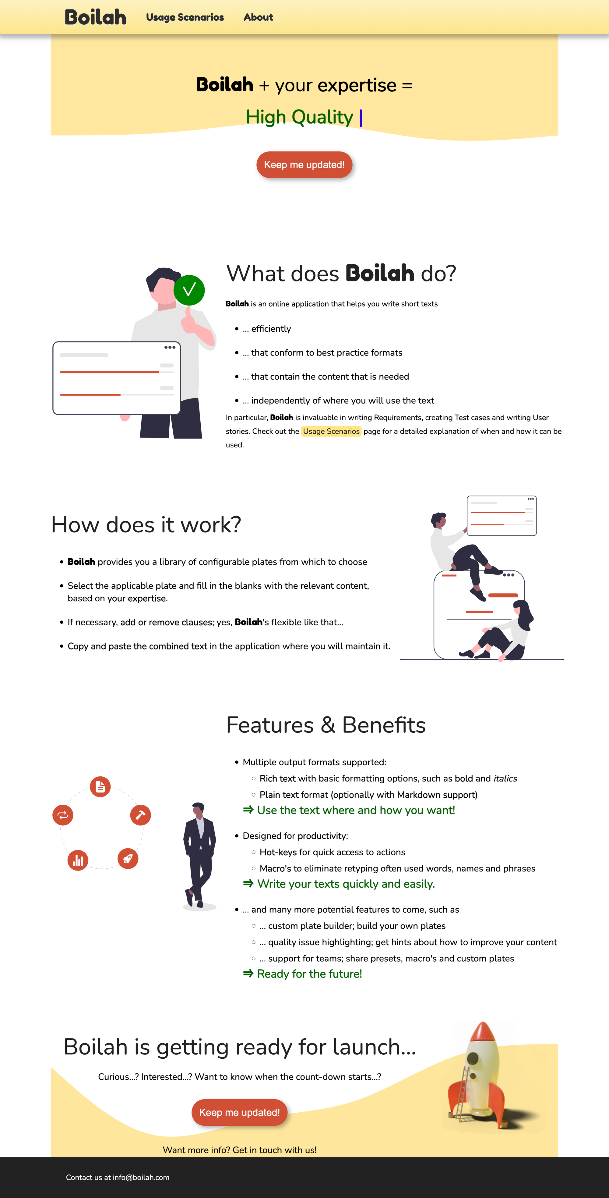
There are two facets to the Boilah landing page that need to be addressed:
- Design
- Product positioning
DESIGN 🎨
This is not comprehensive, but a few pointers to boost the design.
- The fastest and best way to get a good design is to start with a great theme. Find a theme that works with your tech stack and comes with components and sections pre-built.
- Yellow is a difficult color to pull off. That's one reason you don't see many yellow brands. Go for a simple color palette in the blue/green spectrum starting out.
- Product screenshots are super important. Replace illustrations with screenshots.
- Use a strong classic font. Inter or Public Sans would both be good options for you. (only use 1)
PRODUCT POSITIONING 🎯
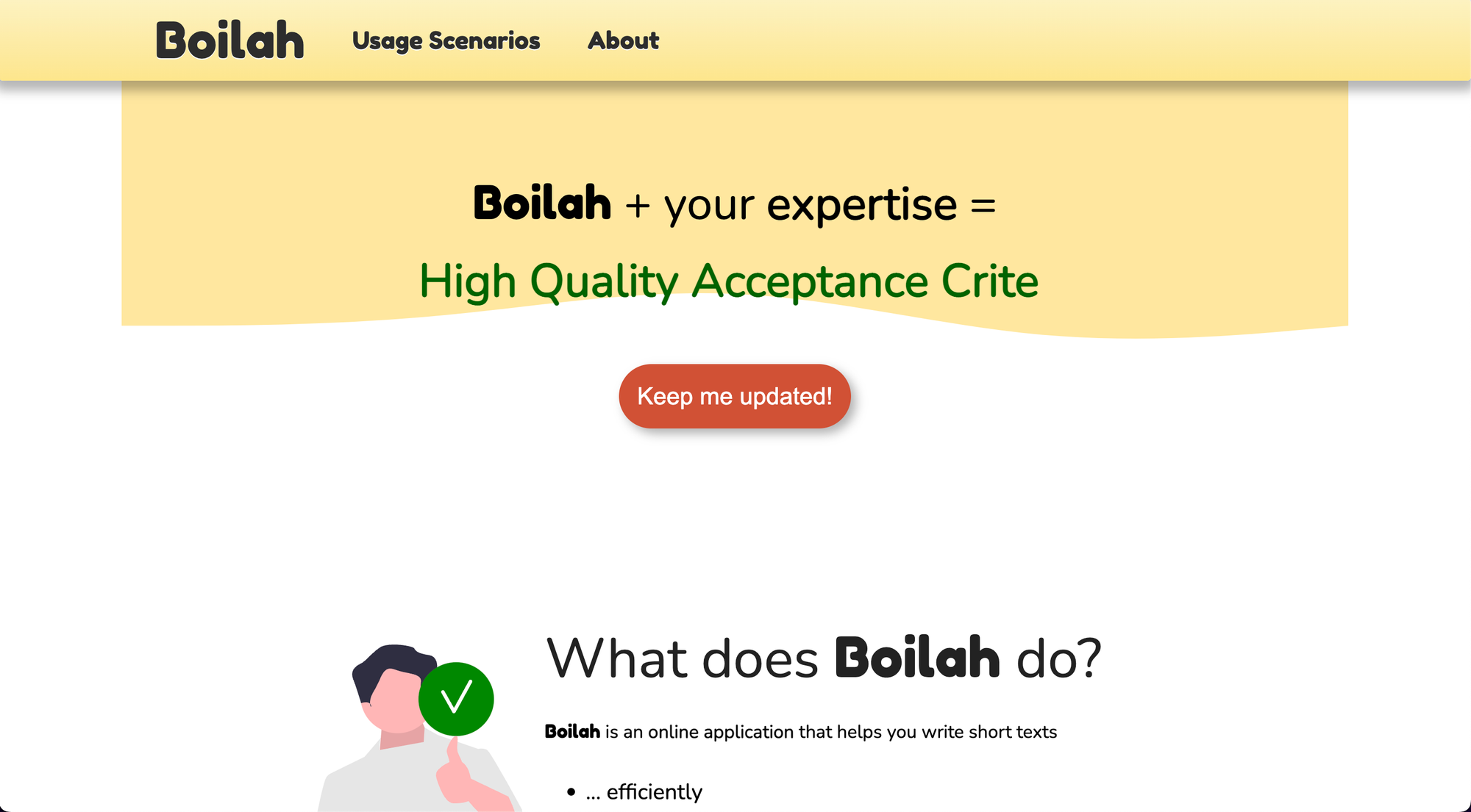
I did not understand what the product was until reading and clicking on other pages.
- Make the Headline simple and straightforward:
- Current: "Boilah + your expertise = High Quality Specifications"
- Better: "Write high-quality Product Specs that ship"
- Subtext. Add subtext below the Headline that further explains the product.
- CTAs need to be consistent. Make it clear what the CTA buttons will do and why a user should want to click.
- Current: "Keep me updated"
- Better: "Get early access"
- Later when the product is active change the text to a strong first step, like "Get started for free"
- Add use cases on the main Landing Page, not hidden on the interior page. List each use case with a checkmark, like this:
- ✅ Software dev
- ✅ Gaming
- ✅ Mobile apps
- ✅ Product design
BONUS: COMPARABLES ⚖️
See how these products position their offering.
Notion. Has similar aspects to what you are building. Documents, templatizing, teamwork, etc.ProductPlan. Competitor?ProdPad. Competitor?
