Post: Roast Stock Alarm! on Indie Hackers
📝 Review
TL;DR ⭐️
- The product looks really good!
- The existing customer base is the most powerful/valuable asset.
- The website does not do the app justice.
BREAKDOWN 🎯
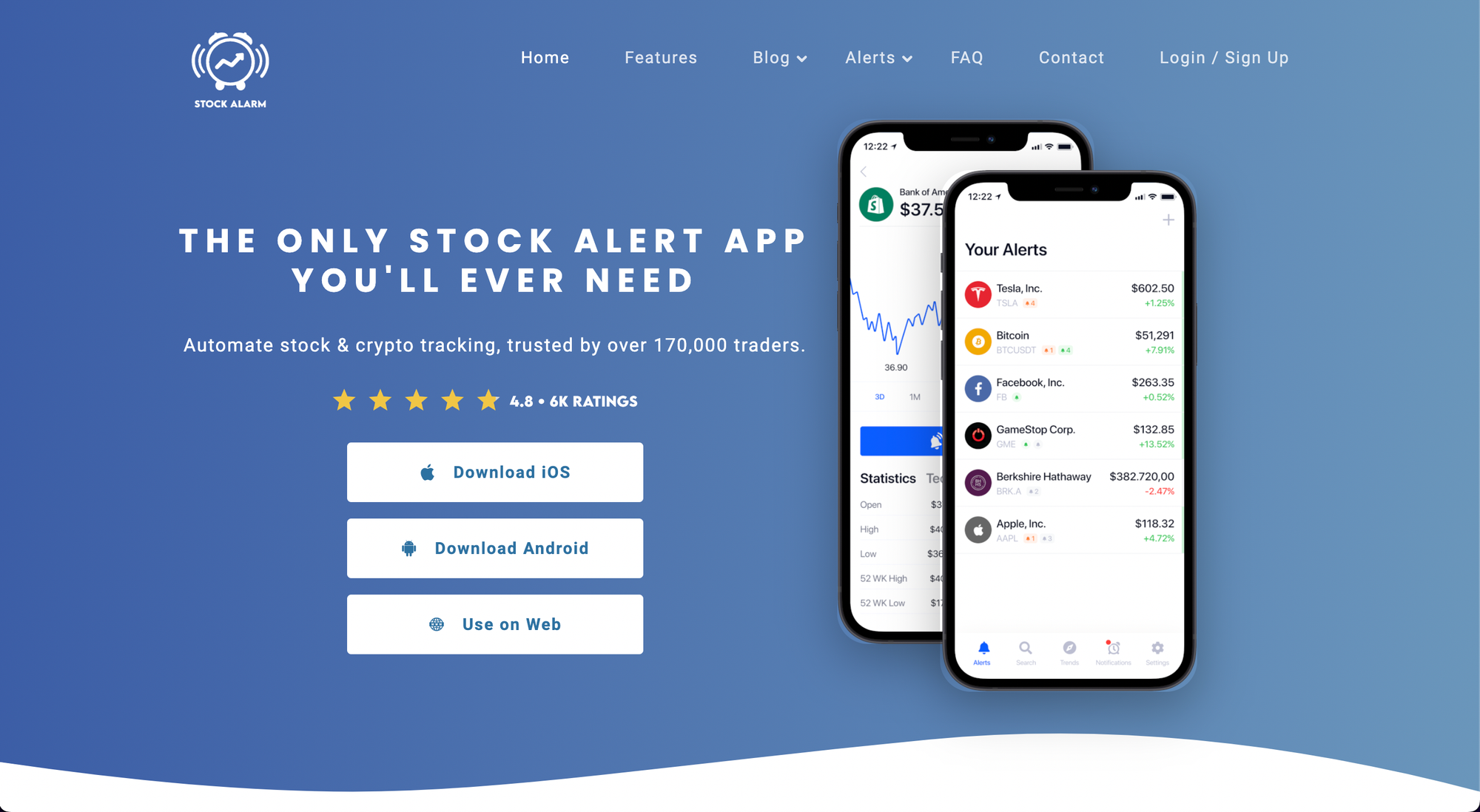
1. Hero
- Headline. Needs a stronger headline that distinguishes the product from competitors.
- Subtext. Provide a longer subtext introducing the product.
- CTA. Use branded Apple and Android buttons. Makes it clear to people that this is a mobile app.
- Image. Make the image more dynamic by having a zoomed-in view of the mobile device with alert overlays hovering over the device.
- Social proof. Need design work
2. Existing users and ratings
This is your existing goldmine. 4.8 stars and 6k+ reviews are exactly what people want to see. These stats deserved their own section band.
3. Testimonials
- Pump up the testimonials.
- Show more than one at a time. Show many.
- Testimonials should only be 1 sentence long. Clip a single sentence to use out of long testimonials.
- User photos would be a huge boon to add and associate the testimonials with real humans.
4. CTA
- CTA needs to be consistent through and pump it up.
- The challenge is that there are 3 funnels for the CTA depending on what is relevant to the user
- "Download" in the main menu needs to be a big ol' button that stands out. Rename it to "Open App" or "Get App"
5. Screenshots
- We want more screenshots! The app design looks good, give us more!!
- Get rid of the illustrations. They don't add anything.
- When you have a section title like "STOCK ALERTS SO YOU CATCH THE ACTION LIVE" add a relevant image like the lock screen of a mobile device with a push notification from the app.
6. Pizazz
- Forgive me, but the visual design for the LP is meh... It just doesn't stand out or do the product justice. The web and mobile apps look really good and so should the marketing site.
- When a product is about finance, trading, and crypto the design cannot be second rate. Even if the product is only informational the brand design needs to be on the level of Robinhood, Acorns, Betterment, and the like.
- The brand and website design signify the quality and professionalism of the product.
7. Questions
- Going through the site raises a lot of questions.
- Some are answered on the FAQ page, but you could also bring the more common FAQs to the homepage.
- Pricing needs to be addressed on the website.